Avast
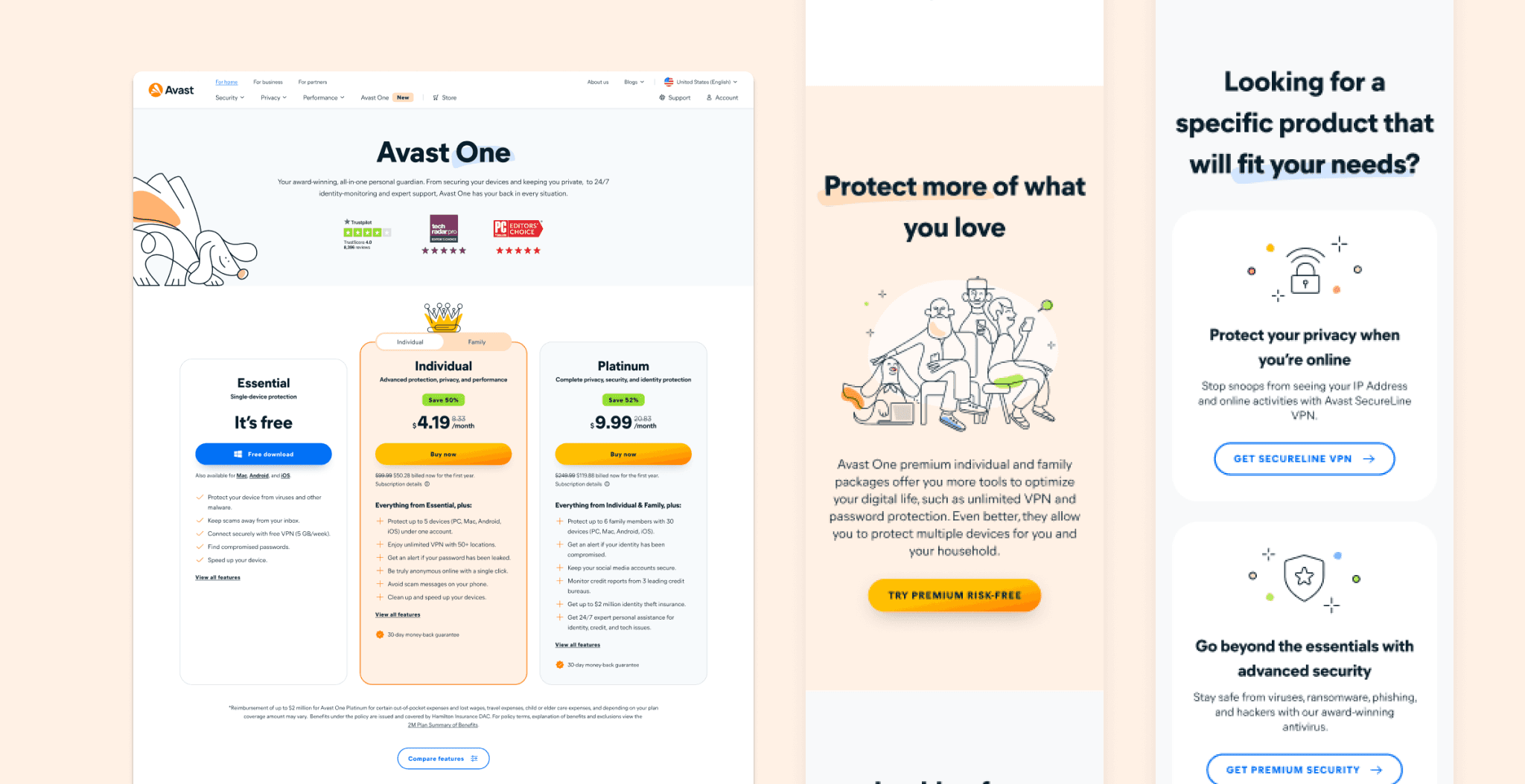
Avast, a leader in cyber security. I was at Avast during a rebranding initiative to modernize its online presence and improve user experience. As part of the design team, I played a role in developing a Figma web design system that created foundation for this transformation, aligning with Avast’s commitment to accessible and digital security solutions.

01
Challenge
The challenge was to create a scalable and flexible design system that would improve design consistency and accelerate development processes. This was done through collaborative development of a detailed Figma web design system that served as the backbone for all website designs.
We have leveraged on the design system during the rebrand by incorporating new tokens (typography, colors and illustrations) in to the library.
02
Solutions
Responsive and accessible designs: Recognizing the diversity of Avast’s user base, I crafted responsive web designs that provided an optimal experience across all devices and screen sizes, ensuring accessibility and efficiency.
A/B/C Testing: To refine user experience and increase conversion rates, I created multiple designs for A/B/C testing with conversion buttons. This testing allowed us to understand user preferences better and make data-driven decisions that enhanced website functionality and user satisfaction.
Dev team collaboration: I worked closely with the development team to ensure that the designs were translated accurately into code. This collaboration bridged the gap between design and development, helped me understand the project goals and technical constraints.

03
Results
The rebranded Avast website established brand’s online presence as new with fun illustrattion and differentiated brand from other dull competitors. My contributions to developing the Figma design system and leading testing and development efforts were helpful in achieving a great user experience.
